The Hidden Tricks Behind Dark Patterns: How Users Are Being Misled Online
Ever felt tricked into signing up for a subscription or buying something you didn’t plan to? You’re not alone. What you experienced was likely the result of a dark pattern—a deceptive design tactic that guides users into making decisions they might not have otherwise made.
From sneaky auto-subscribe checkboxes to misleading cancellation flows, dark patterns are more common than you think—and they’re hurting user trust.
We’ll explore what dark patterns are, how customers fall prey to them, and why brands should prioritize transparency over manipulation.

What Are Dark Patterns?
Dark patterns are user interface (UI) or user experience (UX) designs that intentionally mislead, trick, or coerce users into actions that benefit the business—often at the expense of the user.
These tactics are subtle, but their impact can be significant. They’re often used to:
Increase sign-ups or subscriptions
Prevent cancellations
Gather user data
Push upsells or unnecessary purchases
How Customers Get Manipulated: Common Dark Patterns
1. Hidden Costs at Checkout
What seems like a great deal suddenly becomes expensive due to hidden shipping or service fees added after the user commits to purchase.
🛑 Result: Customers feel misled but may proceed with the purchase anyway to avoid restarting the process.
2. Trick Questions or Confusing Language
Using double negatives or confusing wording in opt-in forms (e.g., “Uncheck if you don’t want to receive promotional emails”).
🛑 Result: Users unknowingly consent to data sharing or email subscriptions.
3. Forced Continuity
Free trials that auto-convert into paid subscriptions without clear notice—and are difficult to cancel.
🛑 Result: Customers get charged without realizing, and often face hurdles trying to cancel.
4. Confirmshaming
Making users feel guilty for opting out. Example: “No thanks, I don’t like saving money.”
🛑 Result: Users are emotionally pressured into actions they don’t really want to take.
5. Bait and Switch
A button or link suggests one outcome but delivers something else. For example, clicking “X” on a popup that actually takes you to another page instead of closing it.
🛑 Result: Users are misdirected or unknowingly opt in to something.
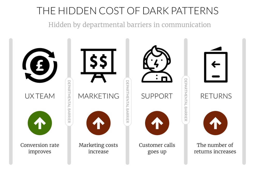
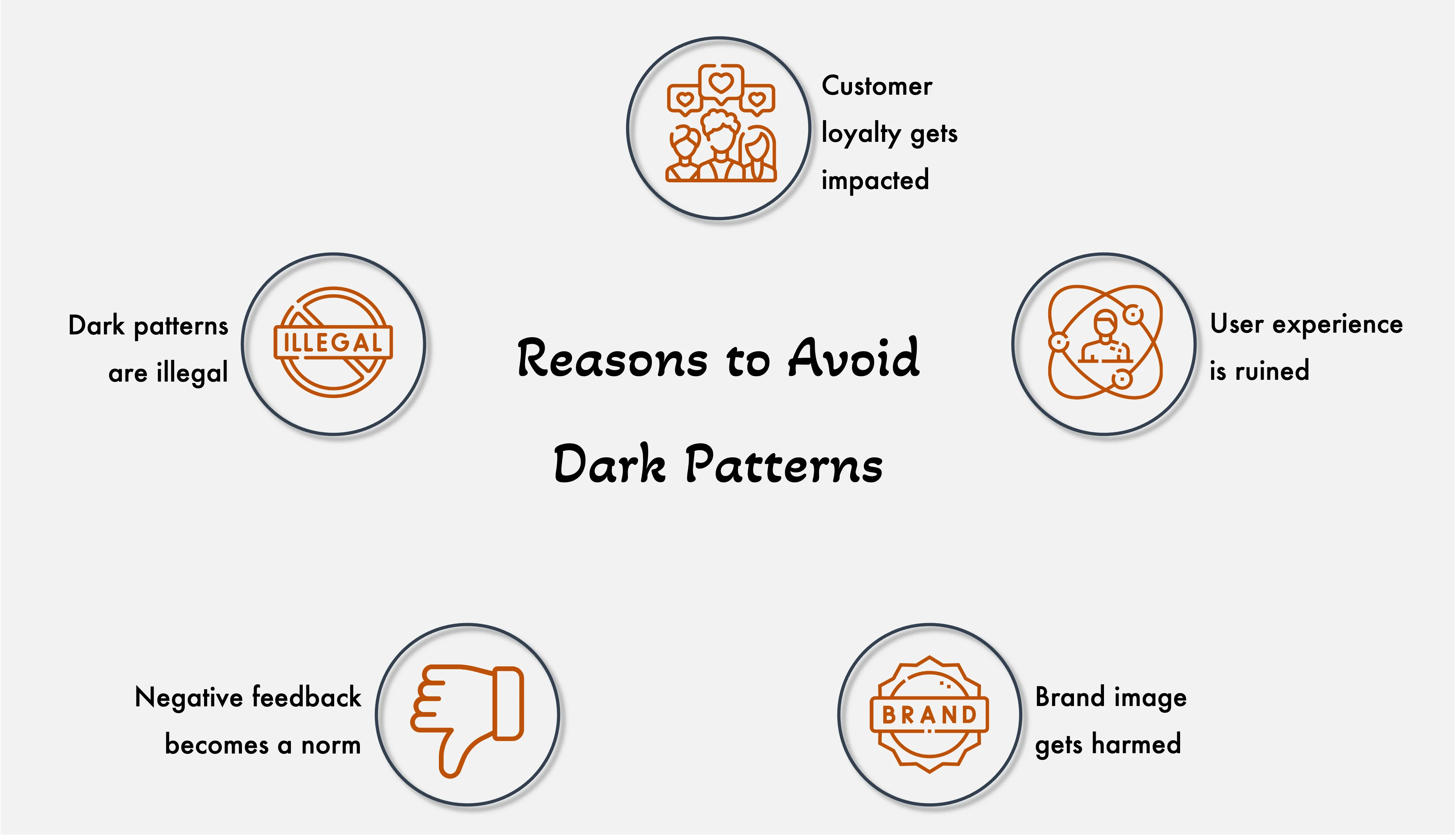
Why Are Dark Patterns Harmful?
Erode Trust: Once a customer realizes they were tricked, they are less likely to return or recommend your brand.
Regulatory Backlash: Countries like India, the U.S., and those in the EU are starting to crack down on dark patterns with stricter data privacy laws.
Negative Reviews: Manipulative tactics lead to poor customer experience, which often shows up in app reviews, social media, and public forums.
High Churn Rate: Customers acquired through deception don’t stick around.
How Brands Can Stay Ethical and Still Win
Transparency doesn’t mean lower conversions—it means sustainable trust and growth.
Here’s how brands can design responsibly:
Use clear, honest language in buttons, popups, and consent forms.
Make cancellation and opt-out processes simple and accessible.
Disclose all charges upfront, especially during checkout.
Design interfaces that guide rather than trap users.
Ask for explicit consent, not implied trickery.
💡 Bonus Tip: Ethical design improves user retention and lifetime value—because customers stick with brands they trust.
Final Thoughts: The Rise of Conscious Consumerism
As digital literacy grows, so does awareness of dark patterns. Today’s customers are more mindful, more informed, and quick to call out shady practices. For brands that want to thrive in this landscape, ethical design is not just a best practice—it’s a competitive advantage.
Let your brand be the one users trust, not the one they warn others about.